
A JavaScript graph library empowers your users to visualize their data through charts, graphs, gauges, and maps. In addition, developers can integrate a JavaScript chart library into their web or mobile app projects.
These libraries often incorporate default capabilities, such as zooming, panning, scaling, and more. They usually include other functions to make the graphs, charts, or maps more interactive and responsive.
This way, developers can easily add a data presentation to their app without writing all the boilerplate code.
Continue reading to discover what most developers expect from a JavaScript graph library. However, all graphing and charting libraries do not always meet these expectations.
We’ll explain how FusionCharts can meet your JavaScript chart library requirements. Moreover, you can create stunning and excellent data presentations, taking your users’ data visualization experience to a new level.
Does the JavaScript Chart Library Include the Proper Visualizations for Your Data?
For a data presentation to be effective, you must choose the correct data visualization method. For example, you might need a financial pie chart or ring financial chart for economic data.
Additionally, for historical data, you would need a JavaScript timeline chart. Similarly, you need a JavaScript bar chart for comparative analysis, a JavaScript stock chart for stock market data, and a JavaScript candlestick chart to display trading or price movements.
While there are many JavaScript chart libraries, they may not include a variety of charts, graphs, gauges, and maps.
However, developers expect the data visualization library to have the correct data visualization method for their specific data, whether open source or paid. In reality, this is not always true.
While all libraries may support the more common JavaScript pie chart, bar chart, and line graphs, they may not include more specialized charts.
FusionCharts offers a variety of charts and comes with more domain-specific graphs, such as:
- Heatmaps
- Marimekko Charts
- Gantt Charts
- Treemaps
- Gauges
- Waterfall Charts
- Spider Charts
Will the JavaScript Graph Library Work on All Browsers?
Another critical aspect of data visualization and JavaScript graph libraries is that they work on all types of browsers. For example, developers expect graphs to be displayed seamlessly on all kinds of machines, whether Windows or Mac.
Unfortunately, this is far from reality. For example, an open-source JavaScript chart or JavaScript gauge chart displayed correctly on a machine running Linux may not render on a Windows machine. The same goes for paid libraries.
FusionCharts has been optimized to run on all types of browsers running. Whether using Safari on Mac, IE on Windows, or Firefox on Linux, FusionCharts is compatible.
Does the JavaScript Graph Library Render Graphs Properly on Mobile Devices?
A significant factor leading to the success of a data visualization library is that it should enable users to access their data presentation anywhere, anytime.
While many charting and graphing libraries work on desktops and laptops, they may not render correctly on mobile devices.
FusionCharts runs not only on desktops and laptops but also on mobile devices. It automatically adjusts its display according to the screen size of the mobile devices, including cell phones and tablets.
You can let users view and monitor data easily on their mobile phones and a desktop or laptop.
Can the JavaScript Chart Library be Integrated into My React Project?
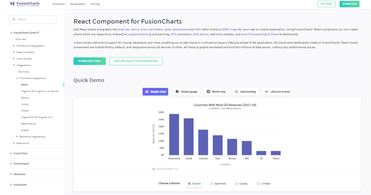
The answer to this question depends on which charting and graphing library you use. Not all JavaScript chart libraries support React. FusionCharts is compatible with the React platform. You can quickly and easily create a React native chart with FusionCharts. Examples of various React charts include:
- Bar chart
- Line chart
- Gauge chart
- Donut chart
Does the JavaScript Graph Library Allow Interactive Visuals?
Interactivity is one of the most important aspects when choosing a charting or graphing library. Not all charting and graphing libraries meet this expectation. However, FusionCharts offers interactive data visualizations.
FusionCharts allows you to create interactive data visuals. All graphs, charts, and maps have the default functionality, making them interactive and responsive. As a result, developers have to spend little or no time creating interactive charts, graphs, gauges, and maps.
By default, almost all FusionCharts visualizations can be zoomed, scaled, and panned. Additionally, interactive legends allow users to focus on specific parts of the data.
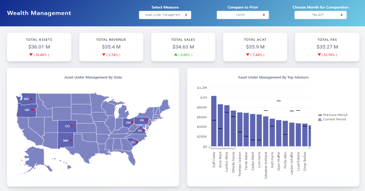
Are There Interactive, Data-Driven Maps?
To display location-based data, you need data-driven maps that show various aspects of the data based on geographic locations.
Not all charting and graphing libraries meet a developer’s expectations regarding stunning data-driven maps. With FusionCharts, all developers can work with different types of maps.
There are a staggering 2000+ choropleth maps to choose from. As a developer, you can integrate data-driven maps into your app without compromising efficiency or speed.