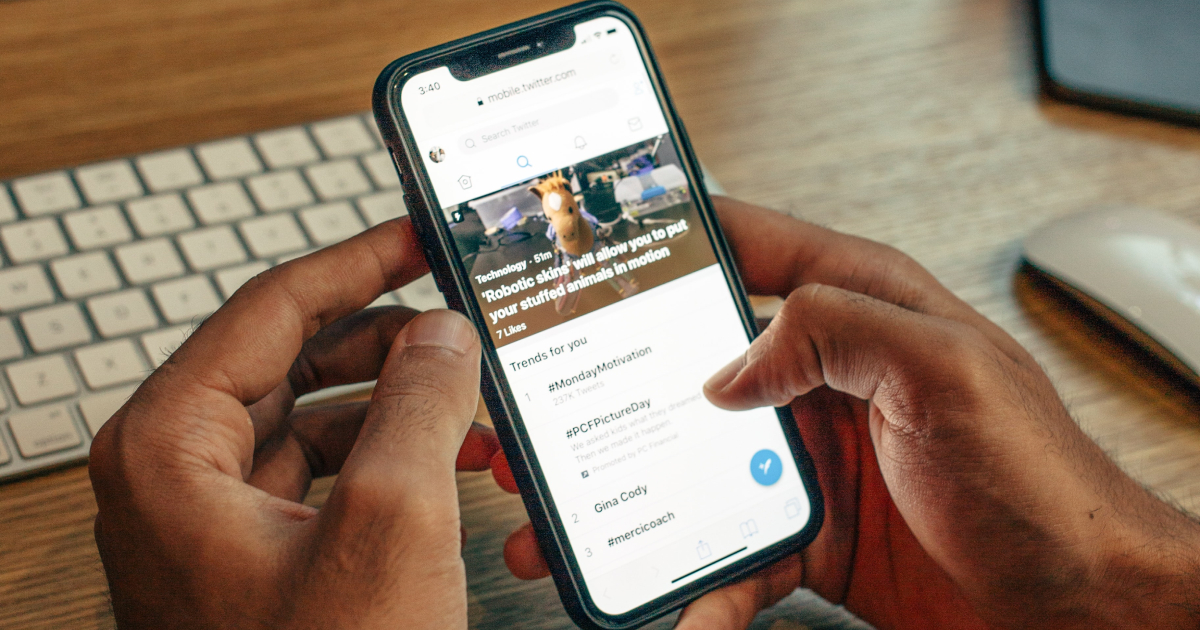
Did you know that Americans spend, on average, over five hours every single day on their cell phones? Whether it is looking at social media, surging the web, or playing games, it is vital that businesses shift their marketing strategies to be mobile-friendly.
Have you ever wondered what a mobile visitor can experience when they visit your site on a mobile device? Here are some tips to ensure that they have an enjoyable experience.
1. Make It Touch Responsive

One of the biggest keys to responsive web design is to ensure that it is touch responsive. When placing buttons, make sure that they are large enough to accommodate human fingers easily.
You should space out elements enough to avoid users accidentally touching a button or navigating to a different web page. Be especially cognizant when it comes to people spending money or using a smooth checkout process to buy a product.
2. Integrate Mobile-Friendly Media
If you have media on your websites such as videos or images, you need to make sure that users can view and operate them on any mobile device.
During the web design process, set the maximum width for any videos or images. This means that the image can adjust to any screen size by scaling down.
3. Bring in the Experts

If you are lost when it comes to mobile-friendly web design, it may be in your best interest to hire professionals. Even if it is an investment in the beginning, it can save you both time and money in the long run. You can turn your attention towards other things, such as growing your customer base or working on products.
A web design company can optimize your site for mobile use and conduct surveys to see what features users value in mobile device web design. They can also create a plan with you if you need to upgrade your website or scale up as your business grows.
4. Use a Grid-Based Design
Out with pixels, and in with grids. While pixels are fixed and can make or break site quality, using a grid-based design will accommodate a wide variety of screens and setups.
With a grid view, the elements of a page will shift to accommodate each other as well. This means that usually content will fit within the screen size without the user having to zoom in or out to view it.
Cater to Any Mobile Visitor

If you want to attract any mobile visitors to your site, you should not have to worry about whether it will look good on a smaller device. With these tips, you can use responsive web design and ensure that any viewer has a great experience.
Want to learn more about website design, CSS, and how you can achieve the results of a web designer for your company website? Check out our site for answers to all of your website-related questions.