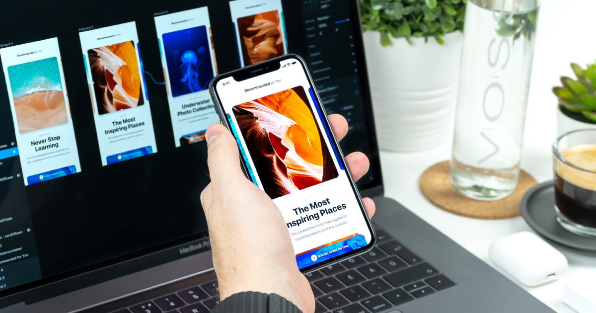
Since the advent of the mobile, it has evolved from being just a communication device. People now depend on mobile devices for online shopping, banking, work, directions, and other functions. Mobile UX (User experience) refers to designing excellent user experiences for handheld and wearable devices.
Mobile users have different needs, and since they do not have large desktop screens, the designs used for their devices have to cater to these needs. The average mobile user in the US spends at least five hours a day on their mobile. Of that time, most of it is spent on websites and apps.
How to Build an Excellent UX for Mobile

What sets apart a good and bad app is the user experience (UX) quality. Today’s mobile user expects a lot from the apps they use, such as ease of use, fast loading times, and generally a pleasant user experience. Below is a guide for building a pleasant mobile UX.
1. Reduce Cognitive Load
Cognitive load means the brainpower needed for using the app. The human brain has limitations in processing power, and if an app dishes out too much information at a go, it overwhelms the user. Some of the things you can do to reduce this load are:
- Decluttering
Clutter is design’s worst enemy. When you clutter the interface, you overwhelm the user with too much information. When you add an extra image, button, or icon, you make the interface more complicated. Clutter is worse on mobile than it is on desktop, considering the screen size. IN mobile design, you need to eliminate anything that is not necessary to improve user comprehension. Functional minimalism is the solution to cluttered user interfaces (UIs).
- Break Down a Task
If a particular task has several actions and steps on the user’s part, divide them into subtasks. This is important in mobile design as it reduces complexity. An example is an e-commerce app where the checkout task is broken down into small tasks, where each requires user action.
2. Minimize the User’s Input

Typing on a mobile screen is not very comfortable, and it is often riddled with errors. The most common user input in mobile is form filling. To make this process easy, you should:
- Keep the form short and simple by eliminating any unnecessary fields. The app should only require the bare minimum of information from the mobile user.
- Provide the user with input masks. Field masking helps a user to format any text they input. Once a user focuses on a particular field, the mask appears and formats the text as the user fills the field. This helps a user to focus on the data needed and to spot errors more easily.
- Make use of smart features such as autocomplete. If a field like address is a problematic one, use a tool like Place Autocomplete Address Form. This tool addresses pre-filling and geo-location to give accurate suggestions based on the user’s physical location. This also enables users to input their address by typing less than they would with a regular address input field.
3. Make Your Design Consistent
In design, consistency is one of the most fundamental principles as it eliminates any user confusion. Maintaining consistency throughout the app is crucial, and in mobile apps, consistency means:
- Visual consistency where buttons, typefaces, and labels need to be consistent throughout the app
- Functional consistency means the interactive elements should work the same way across the entire application
- External consistency means the design must maintain consistency across various products. This means the user can use the acquired knowledge when using a different product. The user needs to be able to recognize the logo across apps, and you can design an excellent logo with online instructions for free. With this online information, these ideas will help you to design a logo. Make a logo that will stand out from the rest.
4. Let the User be in Control

In your design, you need to keep the user in control by keeping the interactive elements predictable and familiar. When an app works the way a user predicts it will, they feel they are in control. Unlike a desktop, where the user can use a mouse to hover over an element to check its interactiveness, mobile users have to tap on the element.
This is why with interactive elements, you have to consider how the overall design communicates. The way an object appears should be enough to tell the user how they should use it. A visual element that has a button-like appearance and is not clickable creates confusion.
Conclusion
Designing a memorable UX is the key to mobile design. Apps should be easy to use and not create confusion for the user. A good app is fast, has no clutter, and lets the user feel in control.
