
Scoreboards used to be simple boxes with numbers. Now they can glow, slide, cheer, buzz, update live, and tell a whole story. A modern interactive scoreboard can show scores, timers, player stats, sponsor logos, fan polls, and instant replays. That sounds big. But modern design tools can make the job much easier.
TLDR: Yes, modern design tools can simplify interactive scoreboard development. They help teams plan layouts, test ideas, build animations, and connect data faster. They also let designers and developers work together with less confusion. The best tools do not replace skill, but they remove many boring and messy steps.
What Is an Interactive Scoreboard?
An interactive scoreboard is more than a screen with numbers. It reacts to data. It updates in real time. It may respond to taps, clicks, voice commands, sensors, or live game feeds.
Think of a basketball game. The scoreboard shows the score. Easy. But now add a shot clock, team fouls, player photos, stats, timeouts, ads, crowd prompts, and social posts. Now the board feels alive.
It can also support fans at home. A web scoreboard may let users choose a player, view a heat map, check match history, or vote for the player of the game. This is where things get exciting. It is also where things can get tricky.
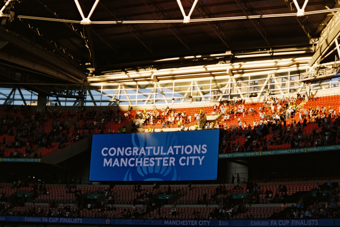
Why Scoreboard Development Can Be Hard
At first, a scoreboard seems easy. Put a few numbers on a screen. Done, right? Not really.
A good scoreboard must be clear. It must be fast. It must be reliable. It must look good from ten feet away, or from the last row of a giant stadium.
It must also handle pressure. A score change at the wrong time is not just annoying. It can cause boos. Loud boos. Maybe snack throwing. Nobody wants popcorn drama.
Here are a few common challenges:
- Real time updates: Scores and stats must change instantly.
- Readable design: Fans need to see key facts in seconds.
- Many screen sizes: A board may appear on phones, tablets, TVs, and giant LED walls.
- Animations: Motion should feel fun, not distracting.
- Data connections: The scoreboard may need live feeds from sports systems.
- Error handling: Bad data should not break the whole display.
That is a lot. This is why modern design tools matter.
How Modern Design Tools Help
Modern design tools are like a friendly workshop. They give teams a place to sketch, test, fix, and polish ideas before deep coding begins. This saves time. It also saves nerves.
Long ago, teams often jumped from a rough idea straight into code. That could work. But it was risky. If the layout was wrong, developers had to rebuild parts again. If the animation felt odd, someone had to explain it with many hand waves.
Today, teams can create interactive prototypes first. A prototype is a working model. It may not connect to real game data yet. But it can show how the scoreboard will feel.
Designers can click buttons. They can test score changes. They can preview countdowns. They can try bright colors, dark themes, or giant player cards. Everyone can see the idea before it becomes expensive.
They Make Layouts Easier
A scoreboard is a battle for space. Everything wants attention. The score wants attention. The timer wants attention. Sponsors want attention. Player stats want attention. Even the mascot wants attention. The mascot is very needy.
Design tools help teams create neat layouts with grids, spacing guides, and reusable parts. A designer can build one score box and reuse it for both teams. Change it once, and all copies can update.
This is useful for consistency. Fans should not have to search for information. The home score should always be in the same place. The time should be easy to find. Big moments should stand out.
Simple layouts win games of attention. If a fan can understand the board in two seconds, the design is doing its job.
They Help With Colors and Contrast
Scoreboards love color. Team colors are important. Brand colors are important. But color can also cause chaos.
Imagine red text on a bright orange background. Ouch. Now imagine that on a sunny field. Double ouch.
Modern tools often include contrast checks, color styles, and theme systems. These features help designers choose colors that are readable. They also help teams create light modes, dark modes, and event themes.
For example, a scoreboard may need different looks for:
- A daytime baseball game.
- A night football game.
- An esports tournament.
- A school sports event.
- A sponsor takeover.
With shared styles, teams can switch themes faster. They do not have to repaint every button by hand like tiny digital elves.
They Make Motion Less Scary
Motion is fun. A goal animation can make fans roar. A timer pulse can add drama. A win screen can feel like fireworks without the fire marshal showing up.
But motion can also go wrong. Too much movement can be hard to read. Slow animation can make a scoreboard feel late. Flashy effects can annoy users.
Modern tools let designers test motion early. They can show how the score changes. They can test a player stat slide in. They can preview a warning when the clock hits ten seconds.

This matters because animations are part of communication. A quick flash can say, “Look here!” A gentle pulse can say, “Time is running out.” A huge spinning dragon can say, “Maybe too much.”
They Improve Team Communication
Scoreboard projects need many people. Designers. Developers. Product managers. Sports staff. Data providers. Sometimes coaches. Sometimes sponsors. Sometimes one person named Dave who has strong opinions about font size.
Modern design tools give everyone a shared visual reference. Instead of saying, “Make the box slightly more exciting,” a designer can show the exact box. Instead of guessing the spacing, developers can inspect it.
Many tools allow comments right on the design. This is useful. A coach can point to the timer and ask for it to be bigger. A sponsor can request a logo area. A developer can ask how long an animation should last.
Clear comments reduce confusion. Less confusion means fewer meetings. Fewer meetings means more time to build cool things. This is a win.
They Support Reusable Components
Interactive scoreboards often use the same parts again and again. Team cards. Timer blocks. Stat rows. Player badges. Alert banners. Buttons. Tabs. Charts.
Modern design tools let teams create component libraries. These are sets of reusable design pieces. Developers can also match them with code components.
This creates a design system. That may sound serious. It is. But it is also simple. A design system is like a recipe book for your interface.
It answers questions like:
- How big is a score number?
- What color is a timeout alert?
- How does a stat card open?
- What does an error message look like?
- How should sponsor graphics appear?
With reusable parts, teams move faster. They also make fewer mistakes. The scoreboard feels like one product, not a pile of random screens wearing the same jersey.
They Help Test Before Launch
A scoreboard must work under stress. Game day is not the time to discover that the timer overlaps the score. That is like finding out your shoes are glued together during a race.
Design tools help teams test flows before launch. They can simulate score changes, period changes, penalty states, overtime, and sudden wins. They can also test weird cases.
Weird cases are important. Sports are full of them. What if a team has a very long name? What if a player has three last names? What if a match goes into double overtime? What if the data feed goes silent?
Prototypes help spot these issues early. They do not catch everything. But they catch many things before code gets complicated.
They Can Work With Real Data
Some modern tools and related workflows can connect designs to sample data or live data previews. This is powerful. A scoreboard with fake, perfect data may look great. But real data is messy.
Real team names vary. Real stats change fast. Real logos have odd shapes. Real sponsors send files named things like “final final final use this one.”
By using realistic data during design, teams can see what breaks. They can adjust text rules. They can test loading states. They can design empty states. They can prepare for errors.
An empty state is what users see when there is no data yet. It should not look broken. It should say something helpful, like “Stats will appear when the game starts.”
They Make Mobile Scoreboards Better
Not every scoreboard lives in a stadium. Many live on phones. Fans check scores while standing in line, riding a bus, or pretending to listen during a family dinner. We do not judge.
Mobile scoreboards need careful design. Small screens have limited room. Fingers need big tap targets. Data must load fast. Important facts must be clear.
Modern design tools allow responsive layouts. This means the design can adapt to different screen sizes. The same scoreboard can have a wide stadium version, a tablet version, and a phone version.
This helps teams think beyond one display. It also helps create a smoother fan experience across platforms.
What Design Tools Cannot Do
Modern tools are helpful. But they are not magic wands. They cannot fix bad planning. They cannot write every perfect line of code. They cannot make a confusing scoreboard clear by adding glitter.
Teams still need good decisions. They need to know what users need first. They need strong development. They need testing. They need performance checks. A scoreboard that looks beautiful but updates slowly is still a problem.
Also, interactive scoreboards often need serious engineering. Real time systems may use sockets, APIs, data pipelines, caching, and backup plans. If the network fails, the design tool will not run onto the field and fix it.
So the answer is balanced. Modern design tools simplify development. They do not remove the need for expertise.
Best Practices for Simple Scoreboard Design
Want to build a better interactive scoreboard? Keep these rules in your pocket.
- Show the most important thing first. Usually, that means score and time.
- Use big numbers. Tiny scores are scoreboard crimes.
- Keep animations short. Fun is good. Delay is bad.
- Plan for bad data. Empty, late, or strange data will happen.
- Test on real screens. A design may look different in a stadium or on a phone.
- Make components reusable. Your future self will clap.
- Use clear contrast. Fans should not need detective skills.
- Get feedback early. Fixing a prototype is cheaper than fixing finished software.
So, Can Modern Design Tools Simplify the Work?
Yes. Very much. Modern design tools help teams move from idea to prototype to build with fewer bumps. They make layouts clearer. They make animation easier to explain. They improve teamwork. They help spot problems early.
They also make development more fun. That matters. Building an interactive scoreboard should feel creative, not like wrestling a wild spreadsheet in a thunderstorm.
The best results happen when designers and developers work together from the start. Designers bring clarity and flow. Developers bring structure and performance. Sports experts bring game knowledge. Fans bring noise. Lots of noise.
When these groups use modern tools well, the scoreboard becomes more than a display. It becomes part of the event. It builds tension. It celebrates big moments. It helps fans understand the action.
So, the next time you see a scoreboard flash, update, and roar with the crowd, remember this: behind those bright numbers is a lot of planning. But thanks to modern design tools, that planning can be smoother, faster, and far less scary.
Final thought: A great interactive scoreboard is simple on the surface and smart underneath. Modern design tools help teams reach that sweet spot. The fans see the score. The builders see the system. Everyone gets to enjoy the game.