
Your affiliate marketing landing page should make one clear promise, support it with proof, and send the right visitor to one specific action. That action might be clicking an affiliate link, signing up for a trial, downloading a buying guide, or comparing products. A serious landing page is not a blog post with buttons scattered through it. It is a focused sales asset built around intent, trust, and measured conversion.
TLDR: Build your affiliate landing page around one audience, one offer, and one call to action. For example, a page comparing three email marketing tools may convert better than a generic “best software” page because the reader sees pricing, use cases, pros, cons, and a clear recommendation. In one practical scenario, improving page speed from 4.2 seconds to 1.9 seconds and moving the main call to action above the fold could raise click-through rates from 6% to 10% or more. Trust signals, honest limitations, and clear affiliate disclosure often matter as much as design.
Start With the Visitor’s Intent
Before writing a headline or choosing a template, define why the visitor arrived. Someone searching “best budget standing desk for home office” has very different needs from someone searching “is Brand X standing desk worth it.” The first person wants comparison. The second wants reassurance, warnings, and proof.
A strong affiliate marketing landing page matches that intent immediately. If the visitor has to hunt for relevance, they leave. Honestly, it feels like many affiliate pages are built for the site owner first and the reader second. That is why they feel thin, pushy, or strangely vague.
Ask these questions before building:
- Who is the visitor? Beginner, professional, parent, freelancer, investor, hobbyist?
- What problem are they trying to solve? Save money, reduce risk, compare options, buy faster?
- How close are they to buying? Researching, comparing, or ready to click?
- What would make them hesitate? Price, setup time, hidden fees, poor reviews, confusing features?
Use a Clear Page Structure
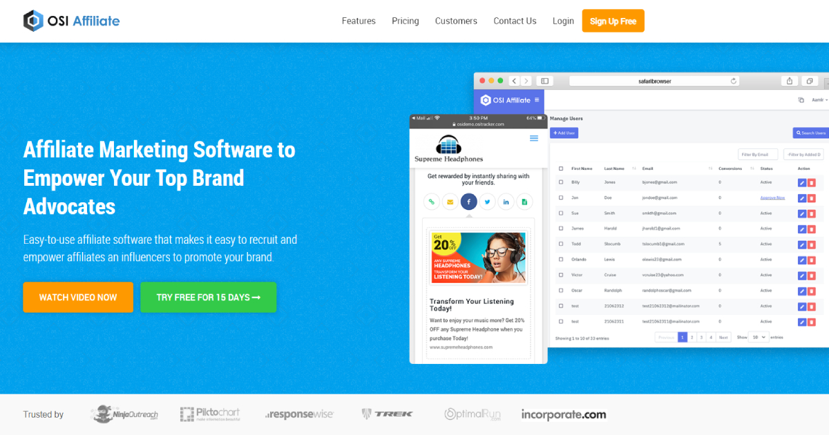
A high-converting affiliate landing page does not need to be flashy. It needs to be easy to understand. The best structure usually looks like this:
- Hero section: A direct headline, short subheading, and primary call to action.
- Problem statement: Show that you understand the reader’s pain.
- Recommended solution: Present the affiliate product or comparison clearly.
- Proof: Add data, screenshots, reviews, ratings, or personal test results.
- Objection handling: Address price, setup, support, risks, and alternatives.
- Call to action: Repeat the next step without being aggressive.
- Disclosure: State your affiliate relationship in plain language.
Your hero section should pass the five-second test. A visitor should know what the page offers, who it is for, and what to do next almost instantly. Avoid clever headlines if they reduce clarity. “Find the Best CRM for a Two-Person Sales Team” is stronger than “Grow Smarter With Better Tools.”
Write Copy That Builds Trust
Trust is the main currency of affiliate marketing. Visitors know you may earn a commission. That is not a problem if you are open about it. The problem starts when every product sounds perfect.
Use plain language. Say who the product is good for and who should skip it. Mention trade-offs. If a tool has strong reporting but weak customer support, say so. If a supplement has clean ingredients but limited clinical proof, say so. Serious buyers respect balanced information.
Use copy like this:
- Good: “This tool is best for small teams that need simple reporting and quick setup.”
- Better: “This tool is best for small teams that need simple reporting and quick setup, but it is not ideal if you need advanced automation.”
- Weak: “This is the ultimate solution for everyone.”
Include an affiliate disclosure near the first affiliate link and again near the bottom if the page is long. Keep it direct: “We may earn a commission if you buy through our links, at no extra cost to you. Our recommendations are based on research, testing, and stated evaluation criteria.”
Show Proof, Not Hype
Claims need support. If you say a product is fast, show measured speed. If you say it is affordable, compare total cost. If you say it saves time, explain the task and the result.
Useful proof includes:
- Original screenshots from product dashboards or setup screens.
- Comparison tables with pricing, features, limits, and refund terms.
- Short case scenarios showing who benefits and why.
- Pros and cons that sound specific, not copied from sales pages.
- Ratings criteria such as value, ease of use, support, speed, and reliability.
For example, instead of saying “easy setup,” write: “Setup took 14 minutes during our test. The payment connection was simple, but the analytics panel took two extra clicks to find.” That sounds real because it is specific.

Design for Conversion, Not Decoration
Good design reduces doubt. It does not distract from the offer. Use enough white space, readable fonts, strong contrast, and buttons that look clickable. Keep the page clean on mobile, since many affiliate clicks come from phones.
The catch is that some page builders add bloated scripts and slow everything down. I have seen simple landing pages take 1.8 seconds longer to load after adding a slider, animation pack, and tracking widgets. That extra delay can cost clicks. Speed is not a technical detail. It is part of conversion.
Use these design rules:
- Place the main call to action above the fold.
- Use one primary button style so visitors know what matters.
- Repeat the call to action after proof sections and comparison tables.
- Avoid visual clutter near affiliate links.
- Make tables scroll well on mobile.
- Compress images before uploading them.
Create Calls to Action That Match Buyer Readiness
Not every visitor is ready to buy. A good landing page can offer different actions without becoming messy. For warm visitors, use a button like “Check Current Price” or “Start Free Trial”. For colder visitors, use “Compare Plans”, “See Full Feature List”, or “Download Buying Checklist”.
Button text should reduce uncertainty. “Click Here” is weak. “See Pricing on Official Site” is stronger because it tells the visitor what happens next. If the link opens a merchant page, make that clear. Do not trick people into clicking.
Use Comparison Tables Carefully
Comparison tables can improve affiliate conversions because they reduce mental effort. They work best when visitors are comparing several options and need quick clarity. But tables become useless when every product gets five stars.
A serious table should include:
- Best use case
- Starting price
- Main strength
- Main weakness
- Refund policy or trial length
- Affiliate call to action
If you recommend one top choice, explain why. Do not bury the reasoning. A simple note such as “Best overall for beginners because it has the shortest setup time and the clearest onboarding” can help the visitor make a confident decision.

Track the Right Metrics
You cannot improve what you do not measure. At minimum, track page views, scroll depth, button clicks, affiliate link clicks, conversion rate, device type, and traffic source. If possible, tag each button separately. A top hero button and a bottom review button may perform very differently.
Watch these numbers:
- Click-through rate: The percentage of visitors who click an affiliate link.
- Conversion rate: The percentage who complete the merchant-side action.
- Bounce rate: A signal that the page may not match intent.
- Average engagement time: Useful for longer comparison pages.
- Revenue per visitor: The clearest business metric.
Test one change at a time. Change the headline, button text, table order, or proof section. Do not change everything at once, or you will not know what worked. A 12% lift from cleaner button text may sound small, but across 20,000 monthly visits it can be meaningful.
Keep Compliance and Accuracy Tight
Affiliate pages can create legal and reputation risks. Use accurate claims. Update prices and product details often. Add disclosure. Avoid fake scarcity, fake reviews, and unsupported income claims. If a product has medical, financial, or legal implications, be extra careful and cite credible sources.
Also check affiliate program rules. Some brands restrict bidding on trademark terms, using certain images, or making coupon claims. Expect to waste time on this if you ignore the rules early. Fixing rejected commissions later is far more annoying than reading the terms before launch.
Final Checklist Before Publishing
- The page targets one clear audience and one main intent.
- The headline explains the benefit in plain language.
- The affiliate disclosure is visible before or near the first affiliate link.
- Claims are supported by screenshots, testing, data, or clear criteria.
- The main call to action is easy to find on desktop and mobile.
- The page loads quickly and avoids unnecessary effects.
- Comparison tables are honest and useful.
- Tracking is set up before traffic is sent to the page.
A strong affiliate marketing landing page does not pressure visitors. It helps them decide. When the page is clear, honest, fast, and useful, conversions become a result of trust rather than tricks.