

Use Miro when the prototype is still a conversation; use Figma when the prototype must behave like the real product. That is the cleanest way to compare the two tools for interactive product prototyping.
TLDR: Miro is best for early product thinking, journey maps, rough flows, workshops, and stakeholder alignment. Figma is better for polished interactive prototypes with reusable components, transitions, overlays, and realistic app behavior. For example, a SaaS team might use Miro to map 42 onboarding steps down to 18, then move into Figma to test a clickable prototype with 12 users and measure where 35% drop off. If you need speed and group input, start in Miro; if you need fidelity and usability testing, finish in Figma.
Miro prototyping is not trying to be Figma, and that is fine
Miro shines when a product idea is messy. You have sticky notes, screenshots, user quotes, rough sketches, flow diagrams, and that one stakeholder who keeps saying, “Can we just see the full journey?” Miro gives teams a shared space to think out loud.
That makes it strong for concept prototypes. These are not pixel-perfect screens. They are working explanations. A Miro prototype might show how a customer moves from an email to a landing page, then to signup, then to the first empty dashboard. You can connect frames, add links, place comments, and present the flow in a way that feels easy for non-designers.
Figma, on the other hand, is built for interface design. It handles layout, components, variants, interactions, and realistic screen behavior with far more control. If your prototype needs a dropdown, modal, hover state, tab bar, carousel, or mobile app transition, Figma is usually the better tool.
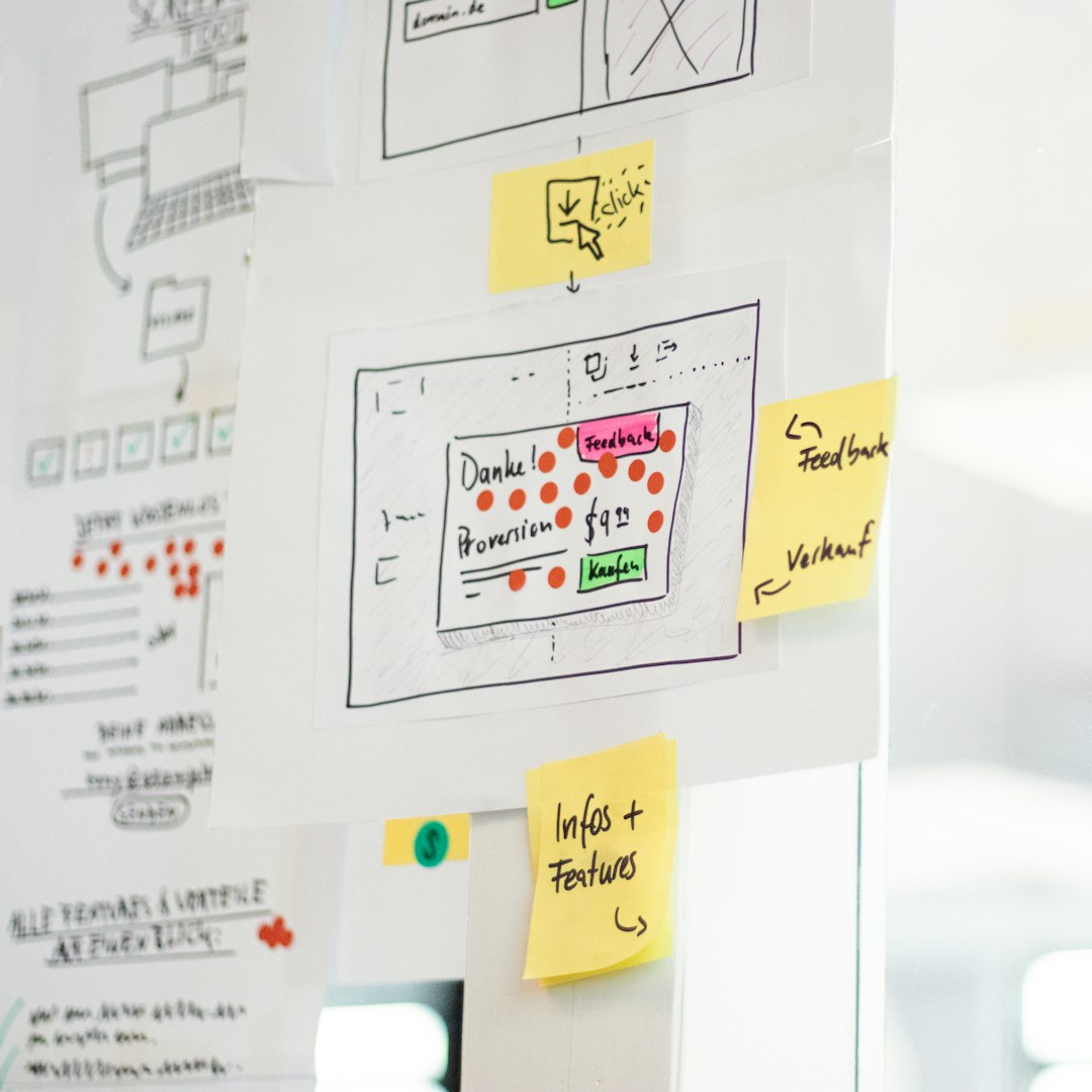
Where Miro wins
Miro is excellent when the team still needs to agree on what should exist. It reduces the pressure to make things look finished too soon. That matters. A polished screen can fool people into debating colors and button labels before the product logic is clear.
Use Miro for:
- Early ideation: collect ideas, sketches, screenshots, and competitor notes in one board.
- User journeys: map steps before, during, and after product use.
- Workshop prototypes: let product managers, designers, engineers, and sales teams shape the flow together.
- Service design: connect product screens with emails, support actions, CRM events, and offline steps.
- Stakeholder walkthroughs: turn frames into a guided story without asking everyone to learn design software.
The best part is how approachable it feels. A product manager can add a sticky note. A researcher can attach interview clips. An engineer can flag a technical risk. Nobody needs to ask where the layers panel went.
The annoyance? Precision is not Miro’s strength. Aligning interface elements can feel clunky compared with Figma. Expect to waste time on small layout fixes if you try to make Miro behave like a screen design tool. It drives me crazy when a simple UI block takes 20 seconds longer to tidy up than it would in Figma.
Where Figma wins
Figma is the stronger choice when the team needs to judge the actual user experience. It lets you build prototypes that feel close to production. You can define interactions, reuse components, show overlays, create scrollable areas, and test alternate states.
That matters because user feedback changes when the prototype feels real. A customer may understand a Miro flow, but they cannot always feel the friction. In Figma, they can click the wrong thing, hesitate on a form, move back, open a menu, or miss a key call to action. Those moments reveal design problems.
Figma is better for:
- High-fidelity product screens: dashboards, mobile apps, checkout flows, onboarding, and settings pages.
- Component-based design: buttons, fields, cards, menus, and design systems.
- Interactive testing: realistic click paths, conditional-feeling flows, overlays, and transitions.
- Developer handoff: specs, spacing, assets, and reusable design patterns.
- Iteration after feedback: update one component and apply changes across many screens.
Figma also scales better when a prototype grows from 5 screens to 50. Components keep the work under control. Without them, a team ends up fixing the same button label in every corner of the file. Nobody enjoys that.

Interactivity: simple links versus real product behavior
This is the heart of the Miro vs Figma comparison. Miro can show movement through an idea. Figma can simulate behavior inside a product.
In Miro, interactivity often means linked frames, embedded assets, comments, and workshop-friendly presentation. That is enough for a concept review. You can ask, “Does this flow make sense?” or “Are we missing a key step?”
In Figma, interactivity goes deeper. You can create a mobile menu that opens over the current screen. You can make a settings panel slide in. You can show a disabled button that becomes active after a field is filled, at least through smart screen planning. You can mimic a production app well enough to run a proper usability test.
So the question is not, “Which tool prototypes better?” The better question is, “What kind of truth do we need right now?”
- If you need strategic truth, use Miro: Is this the right journey?
- If you need interaction truth, use Figma: Can users complete the task?
- If you need visual truth, use Figma: Does this interface look and feel ready?
- If you need team truth, use Miro: Do people agree on the plan?
A practical workflow: start in Miro, refine in Figma
Most teams should not pick only one. The stronger workflow is to use both, in sequence.
- Map the problem in Miro. Gather research notes, pain points, user goals, and business constraints.
- Sketch the flow in Miro. Use boxes, arrows, sticky notes, and rough screens.
- Review with the team. Remove dead ends before designing polished screens.
- Move key flows into Figma. Build the actual interface with components and layout rules.
- Create the clickable prototype. Add interactions, overlays, scrolling, and realistic states.
- Test with users. Watch where they pause, misclick, or give up.
This workflow saves time because it avoids premature polish. A 90-minute Miro workshop can prevent days of wasted Figma work. If the team finds that the checkout flow needs three fewer steps, you want that discovery before designing every screen in detail.
Collaboration feels very different
Miro feels like a room. Figma feels like a studio. That difference matters.
In Miro, collaboration is broad. Many people can join, comment, vote, cluster ideas, and rearrange material. It is less intimidating for stakeholders who are not designers. Sales, support, product, research, and leadership can all contribute without touching production-ready UI.
In Figma, collaboration is more design-centered. Comments are still useful, and live editing is excellent, but the file structure demands more discipline. Random edits can break components or clutter pages. Honestly, it feels like inviting everyone into Figma too early creates more cleanup than insight.
Image not found in postmetaCost, speed, and learning curve
Miro is faster for group thinking. Figma is faster for detailed interface work. Both have learning curves, but they hit different people.
Non-designers often learn Miro quickly. They can drag notes, draw arrows, and comment within minutes. Figma takes more time because it uses design concepts such as frames, constraints, components, variants, and auto layout. Those features are powerful, but they are not casual.
For speed, use this rule:
- Under 1 hour: Miro for quick flows, workshop boards, and rough product maps.
- 1 to 2 days: Figma for a credible click-through test of one core journey.
- 1 week or more: Figma for a refined prototype tied to a design system.
Which should you choose?
Choose Miro if your prototype is meant to explain, align, explore, or compare options. It is ideal before the team commits to a specific interface. It helps people see the whole product story, including steps that happen outside the screen.
Choose Figma if your prototype must be tested like a real app or website. It is the right tool when visual design, interaction quality, responsiveness, and handoff all matter.
The smartest teams treat Miro and Figma as partners. Miro helps you decide what to build. Figma helps you prove how it should work. Use Miro to reduce confusion. Use Figma to reduce usability risk. That split keeps meetings clearer, prototypes sharper, and product decisions less painful.