Color grading can feel like a mysterious final step reserved for professional filmmakers, but DaVinci Resolve makes it surprisingly approachable for beginners. Whether you are editing travel videos, short films, YouTube content, music videos, or client projects, learning the basics of color correction and grading will instantly make your footage look more polished, consistent, and intentional.
TLDR: Start by correcting your footage before trying to create a dramatic look. Use the Color Page in DaVinci Resolve to adjust exposure, contrast, white balance, and saturation, then build creative style using nodes, LUTs, curves, and color wheels. Keep your grade subtle, check your scopes, and always compare before and after so your image still looks natural and professional.
What Is Color Grading?
Before opening the Color Page, it helps to understand the difference between color correction and color grading. These terms are often used together, but they are not exactly the same.
- Color correction is the technical process of fixing your footage. This includes adjusting exposure, correcting white balance, balancing skin tones, and matching shots.
- Color grading is the creative process of giving your video a specific mood, style, or cinematic look.
For example, if your footage is too blue, too dark, or inconsistent between shots, you correct it first. After that, you might grade it to look warm and nostalgic, cool and futuristic, bright and commercial, or moody and dramatic.
A common beginner mistake is jumping straight into creative looks before fixing the image. If the base correction is poor, even the best LUT or cinematic preset will not save the shot.
Getting Started in the DaVinci Resolve Color Page
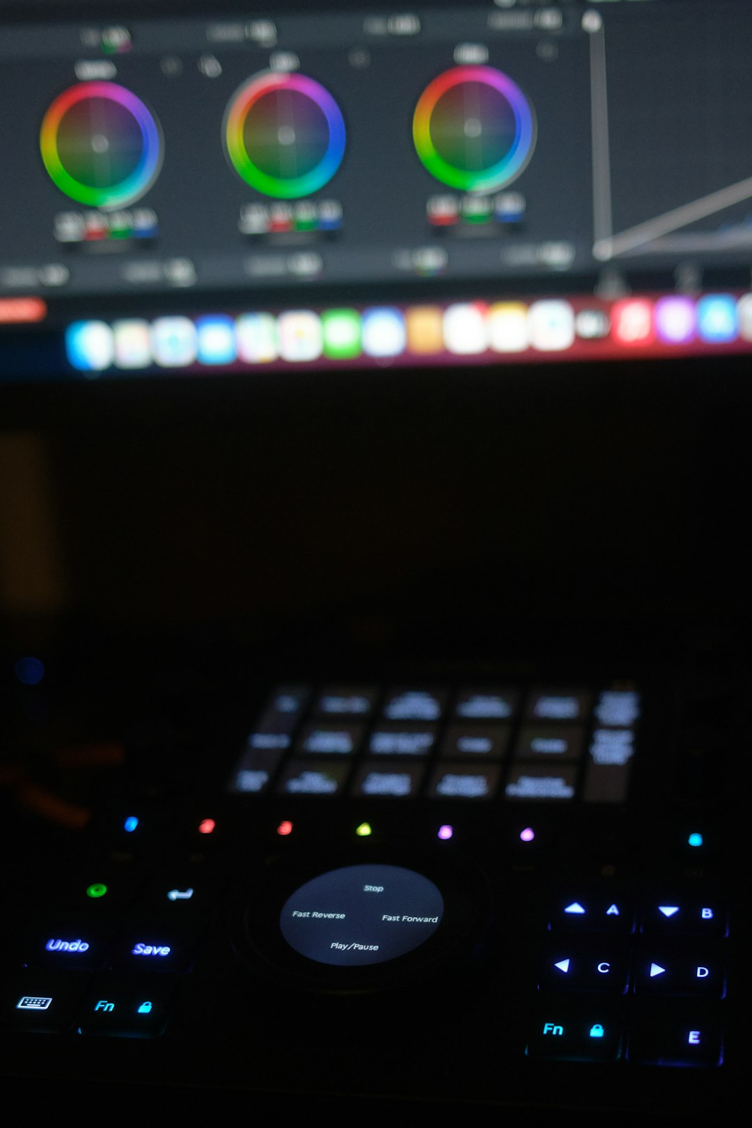
DaVinci Resolve is divided into different workspaces, called pages. For color grading, you will spend most of your time in the Color Page. You can access it by clicking the color wheel icon at the bottom of the interface.
At first glance, the Color Page may look intimidating. You will see viewers, timelines, nodes, scopes, color wheels, curves, and many panels. Do not worry. As a beginner, you only need to understand a few essential tools.
- Viewer: Shows the current frame you are grading.
- Nodes: Let you organize color adjustments in separate steps.
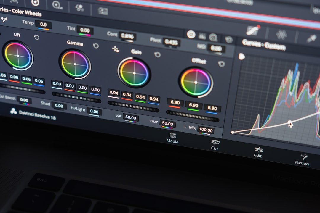
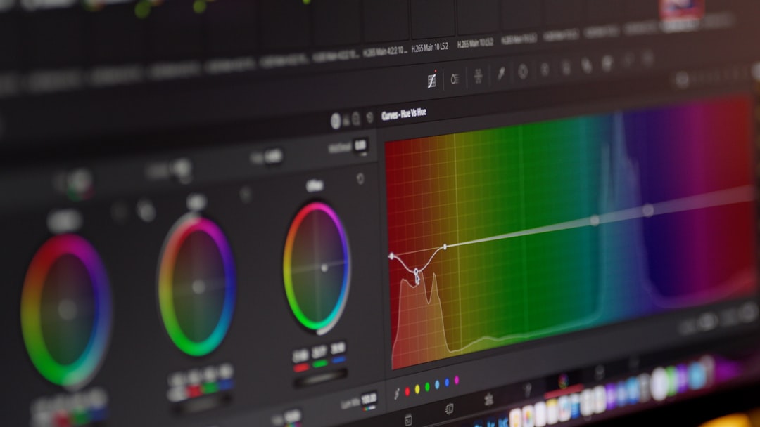
- Color Wheels: Control shadows, midtones, highlights, and overall tone.
- Curves: Help adjust contrast, brightness, and specific color channels.
- Scopes: Give technical feedback about exposure and color balance.
The best way to learn is to use one clip and make small, deliberate changes. Avoid adjusting every control at once. Color grading is about observation, patience, and subtle refinement.
Step 1: Set Up Your Project Correctly
Before grading, make sure your project settings match your footage. If your timeline resolution, frame rate, or color management settings are incorrect, your final image may not behave as expected.
For beginners, DaVinci Resolve’s DaVinci YRGB color science is a simple place to start. If you are working with normal Rec.709 footage from a DSLR, mirrorless camera, drone, or phone, you can usually begin grading immediately. However, if you shot in a flat or log profile, such as S Log, C Log, V Log, or D Log, you may need to transform the footage into Rec.709 before grading.
You can do this using a Color Space Transform effect or a manufacturer conversion LUT. A flat log image may look gray and washed out at first, but it contains more dynamic range and grading flexibility.
Step 2: Learn to Read Scopes
Your eyes are important, but they can be fooled by your monitor, room lighting, or even fatigue. That is why scopes are essential. In DaVinci Resolve, the most useful beginner scopes are the Waveform, Parade, and Vectorscope.
- Waveform: Shows brightness levels from shadows to highlights.
- RGB Parade: Shows red, green, and blue channels separately, useful for white balance.
- Vectorscope: Shows color saturation and helps monitor skin tones.
In the waveform, black is usually near the bottom, white is near the top, and midtones sit between. You generally want to avoid crushing shadows too heavily or clipping highlights unless it is a creative choice. The scopes help you create an image that looks good on different screens, not just your own monitor.
Step 3: Correct Exposure
Exposure is the foundation of a good grade. If a shot is too dark, too bright, or lacking contrast, start here. In the color wheels panel, you will see controls such as Lift, Gamma, Gain, and Offset.
- Lift adjusts the darker parts of the image.
- Gamma adjusts the midtones.
- Gain adjusts the brighter parts of the image.
- Offset moves the entire image brighter or darker.
Start by setting your black levels with Lift, then adjust highlights with Gain, and finally refine the midtones with Gamma. If the face of your subject is too dark, Gamma is often more helpful than simply raising the whole image.
Tip: Do not make your image overly contrasty just because it looks “cinematic.” A professional grade usually preserves detail where it matters.
Step 4: Fix White Balance
White balance controls the overall color temperature and tint of your image. If footage looks too orange, blue, green, or magenta, it needs correction. In DaVinci Resolve, you can use the Temperature and Tint controls, or adjust the color wheels manually.
A simple method is to find something in the shot that should be neutral, such as a white wall, gray shirt, or black object. Then look at the RGB Parade. If one color channel is much higher than the others in neutral areas, the image has a color cast.
For example, if the blue channel is much stronger, the image may look cold. You can warm it up by moving the temperature toward yellow or by balancing the color wheels. If the green channel is too high, add a little magenta through the tint control.
Step 5: Adjust Contrast and Saturation
Once exposure and white balance are balanced, you can improve the image with contrast and saturation. Contrast controls the difference between light and dark areas. Saturation controls the intensity of colors.
Beginners often push saturation too high. This can make skin tones look unnatural and colors appear cheap or digital. A small increase is usually enough. If you want a cinematic look, consider lowering overall saturation slightly while increasing contrast carefully.
You can also use the Custom Curves panel to create an S curve. This is one of the most popular grading techniques. A gentle S curve darkens shadows slightly and brightens highlights slightly, adding depth and punch.
Step 6: Understand Nodes
Nodes are one of the most powerful parts of DaVinci Resolve. Instead of stacking all corrections in one place, nodes let you separate each adjustment. Think of nodes like layers of color work.
A simple beginner node structure might look like this:
- Node 1: Exposure correction
- Node 2: White balance
- Node 3: Contrast and saturation
- Node 4: Creative look or LUT
- Node 5: Final refinements
This structure keeps your grade organized. If something feels wrong later, you can return to one node and adjust it without destroying the rest of your work.
To add a serial node, use Alt + S on Windows or Option + S on Mac. You can label nodes by right-clicking them and choosing Node Label. This habit becomes extremely useful as your grades become more advanced.
Step 7: Use LUTs Carefully
A LUT, or Look Up Table, is a preset color transformation. Some LUTs convert log footage to Rec.709, while others create stylized film looks. LUTs can be useful, but they are not magic.
If you apply a LUT to poorly exposed or incorrectly balanced footage, the result may look harsh, oversaturated, or strange. Always correct your footage before applying a creative LUT. After adding a LUT, reduce its intensity if needed by adjusting the node’s Key Output Gain.
Many beginners use LUTs at full strength and wonder why their footage looks unnatural. Try setting the gain to around 0.3 to 0.7 and adjust from there. The goal is to enhance the image, not overpower it.
Step 8: Pay Attention to Skin Tones
Skin tones are one of the most important parts of color grading. Viewers may not notice perfect contrast, but they will notice if a person’s face looks too red, yellow, green, or lifeless.
The Vectorscope includes a skin tone indicator line. While skin tones vary widely, they generally fall close to this line. You can use the qualifier tool to isolate skin and make small corrections, but beginners should be careful. Over-isolating skin can create unnatural edges or noisy patches.
A helpful approach is to first balance the entire image, then make gentle skin tone adjustments only if necessary. In many cases, good white balance and exposure will solve most skin tone problems.
Step 9: Match Shots in a Sequence
One great-looking shot is not enough. In a finished video, shots need to look consistent. If one angle is warm and bright while the next is cold and dark, the edit will feel distracting.
To match shots, choose a hero shot that looks correct, then compare other clips to it. DaVinci Resolve allows you to use stills in the Gallery. Right-click the viewer and select Grab Still. You can then use this reference while grading other shots.
Look at brightness, contrast, saturation, and skin tone. Use scopes to help you match technical values, but also trust your eyes. The goal is not mathematical perfection; it is visual continuity.
Step 10: Create a Simple Cinematic Look
After correction, you can begin creative grading. A simple cinematic look might include slightly deeper shadows, warm highlights, cooler shadows, controlled saturation, and soft contrast.
Try this beginner-friendly recipe:
- Correct exposure and white balance.
- Add a gentle S curve for contrast.
- Slightly reduce overall saturation if colors feel too strong.
- Push shadows subtly toward blue or teal.
- Push highlights slightly toward orange or warm yellow.
- Keep skin tones natural and avoid extreme color shifts.
This creates a classic warm-and-cool separation without making the image look artificial. Remember that subtlety is key. If viewers notice the grade more than the story, you may have gone too far.
Common Beginner Mistakes to Avoid
- Overusing LUTs: LUTs should support your grade, not replace your decisions.
- Crushing blacks: Deep shadows can look stylish, but losing all detail can make footage look amateur.
- Ignoring scopes: Your monitor may not be accurate, so use scopes as a guide.
- Oversaturating colors: Bright colors can quickly become distracting and unrealistic.
- Skipping shot matching: Consistency matters as much as individual beauty.
- Grading in a bright room: Strong ambient light can affect how you perceive contrast and color.
Final Export Check
Before exporting, watch your video from beginning to end. Do not only check individual clips. Look for sudden changes in brightness, strange skin tones, clipped highlights, or colors that feel inconsistent.
It is also smart to step away for a few minutes and return with fresh eyes. Color grading can become addictive, and after staring at an image too long, you may start making unnecessary changes. Compare your final grade with the original footage using the bypass color grade shortcut, Shift + D, to make sure your work truly improves the image.
Conclusion
Learning color grading in DaVinci Resolve is less about memorizing every tool and more about developing a reliable process. Start with correction, use scopes, organize your work with nodes, and apply creative style carefully. As you practice, you will begin to recognize what an image needs just by looking at it.
The best beginner advice is simple: make small adjustments, compare often, and protect the natural quality of your footage. With time, DaVinci Resolve’s Color Page will stop feeling complicated and start becoming one of the most enjoyable parts of your editing workflow.