
Use a MeWe banner sized at 945 x 320 pixels as your base, with a 3:1 aspect ratio and a higher-resolution export, such as 1890 x 640 pixels, for sharper results. Keep key text, logos, and faces near the center, because MeWe may crop the edges differently on desktop and mobile. If your banner looks blurry, the file is probably too small or too compressed.
TL;DR: The best MeWe banner size is 945 x 320 pixels, but designing at 2x resolution, such as 1890 x 640 pixels, gives you a cleaner upload. Use a 3:1 aspect ratio and keep vital details inside the middle 70% of the image. For example, if 1,000 people view your profile in a month, a cleaner banner with a clear offer or tagline could help turn an extra 5% of those visitors into followers or contacts.
Best MeWe Banner Dimensions
The standard MeWe profile banner dimension to design around is 945 pixels wide by 320 pixels tall. This gives you a wide, shallow header that sits across the top of your profile. It is not a square. It is not a standard photo shape. Treat it like a billboard.
The ideal aspect ratio is close to 3:1. That means the banner is roughly three times wider than it is tall. If you upload an image with a very different shape, MeWe will crop it. Sometimes the crop is fine. Sometimes it chops off half your text. Honestly, it feels like one of those small profile setup tasks that should take 30 seconds but somehow steals five minutes.
- Recommended display size: 945 x 320 pixels
- Best high-resolution upload: 1890 x 640 pixels
- Aspect ratio: about 3:1
- File type: JPG or PNG
- Best file size: under 2 MB when possible
Why Upload a Larger Banner?
A 945 x 320 image can work. Still, a larger version often looks better after upload. Social platforms compress images, and that compression can make small text fuzzy. Designing at 1890 x 640 pixels gives MeWe more image data to work with.
This does not mean you should upload a huge 6000-pixel-wide file. That can slow things down and may get crushed by compression. A 2x version is usually the sweet spot. It gives you better clarity without being absurdly large.
If your banner has only a photo background, 945 x 320 may be enough. If it includes a logo, slogan, product name, event date, or call to action, use the higher-resolution version.
Safe Zone: Where to Place Text and Logos
The most common MeWe banner mistake is placing text too close to the sides. The second most common mistake is placing a face near an edge. Different screens can cut the banner in slightly different ways, especially on mobile.
Use a simple rule: keep anything crucial inside the center 70% of the banner. For a 945 x 320 design, that means the safest content area is roughly the middle 660 pixels of width. Leave extra breathing room on the left and right.
- Safe for text: center area
- Risky for text: far left and far right edges
- Safe for background patterns: full width
- Risky for faces: corners and edges
Also watch the lower area of the banner. Profile photos, buttons, or interface elements may overlap the image depending on the view. Keep the bottom edge clean unless the detail is purely decorative.
MeWe Banner Resolution and Image Quality
For best results, export your MeWe banner at 72 to 144 PPI. PPI matters less for screens than pixel dimensions, so do not obsess over it. Pixel size is the real workhorse.
Use PNG if your design has text, flat colors, icons, or a logo. Use JPG if your banner is mostly a photograph. A high-quality JPG can look great and stay small. A PNG can preserve crisp edges, but it may create a larger file.
| Use Case | Best Format | Suggested Size |
|---|---|---|
| Personal profile with photo | JPG | 945 x 320 or 1890 x 640 |
| Business profile with logo | PNG | 1890 x 640 |
| Event or promo banner | PNG | 1890 x 640 |
| Photography portfolio | JPG | 1890 x 640 |
Profile Design Tips That Actually Help
Your MeWe banner should explain who you are fast. A visitor should understand your theme in two seconds. That sounds harsh, but people scroll quickly. A vague sunset photo may look nice, yet it says very little.
Use your banner to answer one of these questions:
- Who are you?
- What do you share?
- What group, brand, or cause do you represent?
- Why should someone follow or contact you?
A strong profile banner can include a short tagline, a clean background, and one clear focal point. Do not cram in every detail. Tiny text is a waste. If someone has to zoom in, the design has already failed.
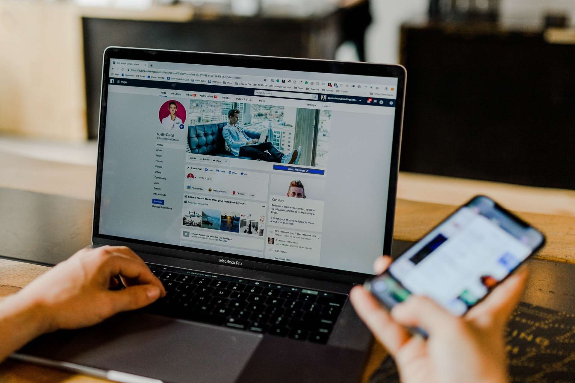
Good MeWe Banner Ideas
For a personal account, use a banner that supports your profile photo. If your profile photo is a close-up portrait, the banner can show your hobby, workspace, city, artwork, or favorite theme. Keep the colors compatible so the profile feels planned rather than patched together.
For a business or creator profile, add a short message. Try something like “Handmade ceramics every Friday”, “Private coaching for new runners”, or “Original sci-fi art and prints”. These lines are direct. They tell visitors what to expect.
For groups, design the banner like a welcome sign. Include the group name, topic, and mood. If the group is private, the banner may be one of the few things people see before joining. Make it count.
What to Avoid
Expect to waste time on edits if you design without checking the crop. The preview can look right in your design app and still feel off after upload. Save a test version, upload it, check desktop and mobile, then revise.
- Avoid tiny text. It often turns blurry after compression.
- Avoid busy backgrounds. They compete with your profile photo and buttons.
- Avoid edge-based logos. They may get cropped.
- Avoid low-resolution screenshots. They look amateurish.
- Avoid heavy filters. They can make text harder to read.
Simple MeWe Banner Layout Formula
If you want a reliable layout, use this formula: background image, center-aligned message, small logo or name, and plenty of empty space. Empty space is not wasted space. It makes the banner easier to read.
Here is a practical structure:
- Background: photo, gradient, texture, or brand color.
- Main text: 3 to 7 words.
- Support text: optional, no more than one short line.
- Logo or symbol: small and centered or slightly off-center.
- Safe margins: at least 120 pixels on each side for a 945-pixel-wide banner.
Final Checklist Before Uploading
Before you upload your MeWe banner, check the basics. Is the image 945 x 320 or a clean 2x version? Is the text readable on a phone? Are faces away from the edges? Does the banner match your profile photo?
If the answer is yes, upload it. If it looks soft, export again at 1890 x 640 pixels. If it crops badly, move your key elements toward the center. A good MeWe banner is not complicated. It just needs the right size, clean spacing, and a message people can understand at a glance.