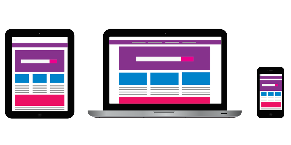
This article will go over what good site navigation should be and how to make it truly effective. It will be helpful for those who want to create their own travel website with the best travel website development company Fireart Studio.
Navigation is the methods, techniques, and special elements that allow you to navigate between its pages. Everything depends on how well it is thought out: both the conversion and the success of the resource promotion.
It can be compared to the layout of a house. If the layout is good, you will easily find the room you need; you will not confuse the entrance to the kitchen with the entrance to the living room. If there are many passages, corridors, and doors, you can get lost in such a house.
Likewise, with website navigation, if the navigation is bad and many links do not lead to where they should be, or it is unclear where they will lead – users are confused and cannot find the pages they need and the information they need.
For search engines, reasonable, logical navigation is also essential. The search engine must understand the role of this page on your site. Well-thought-out navigation also improves behavioral factors, as users find the information they need faster.
Basic elements and techniques of navigation
When building a website, we suggest that you first familiarize yourself with the basic elements that help you navigate the site. Navigation in a broad sense includes many techniques and elements; the main task is to allow the user to go to the desired page and get acquainted with the information.
We suggest that you first familiarize yourself with the basic elements that help you navigate the site. Navigation in a broad sense includes many techniques and elements; the main task is to allow the user to go to the desired page and get acquainted with the information.
One of these elements, which has long become mandatory on the site, is its logo; when you click on it, you get to the main page.
Logo with a link to the home
It is enough to click on the logo to return to the start page. This technique is already familiar to users and allows them to return to the home page from any section of the website. The second “classic” item is the top menu.
Top menu of the site
Top menu is located under the header and consists of buttons or links that lead to the site’s main sections. Such a menu can be more complex, with drop-down lists that lead to subsections or individual pages.
Drop-down menu
In the past few years, another technique has become popular – this is a hamburger menu, in which all links are hidden in schematic three horizontal lines. At first, this element lived only on mobile devices, but now it is increasingly found on desktop versions.
Click here to know more about the drop-down menu and footer of the website.
How to make site navigation convenient

When working on navigation on your site, remember and try to use a straightforward rule: from the main page to any page of the site, the user should get a maximum of three clicks.
1. Place the return to home logo in the upper right corner
It is a generally accepted standard, and for a good reason: it is in this place that the logo immediately catches the eye. And the user does not have to search for what to click on to return.
2. Think over the primary and secondary elements
The top menu can be primary—secondary or on the side, with additional links inside the text, in the footer. Breadcrumbs can also act as secondary navigation elements.
Navigation elements are where the top menu acts as the main navigation element, and breadcrumbs act as auxiliary. Add the most important sections of the site to the main menu.
3. Think about which pages you can group
Suppose everything does not fit into the top (or side) menu. For example, you can often find an option when some site sections are hidden under one button, “Information,” “More,” etc.
4. Find a good place for informational links
Informational links are such as “Contacts,” “Public offer,” and the like. The user must find these links on all pages of the site. Therefore, the most suitable place for them is the footer.
5. Don’t forget about design
All navigation elements should be visible, and it should be clear that a link is a link and a button is a button. Highlight links with color; make them bold or underlined. Users must understand that there is a clickable element to send them to another page of the site. A web design company Manchester can help you achieve this with ease.